
Developed by a small, remote, independent startup team based in Toronto, Canada, Mash is a P2p payment SaaS platform.

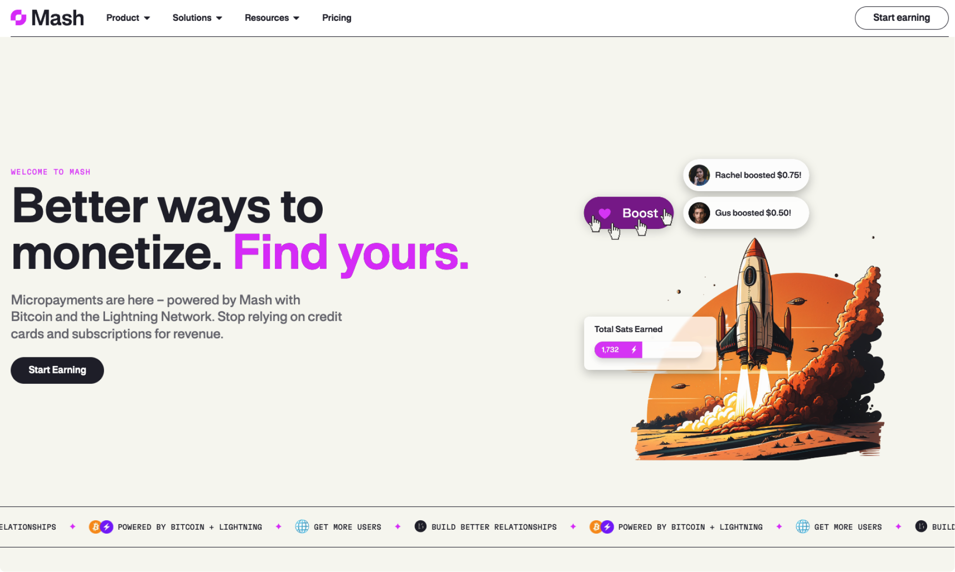
Built to leverage the emergence of the Lightning Network to create an alternative to ad-heavy, awkward content platforms, Mash is a simple, customizable digital payment method, allowing quick, easy and secure pay-per-use web transactions.
This alternative content monetization method liberates creators from frustrating algorithms, censorship policies, content controls and restrictions, unwanted ads and fees, paid promotions, audience subscriptions, and cross-platform account management.

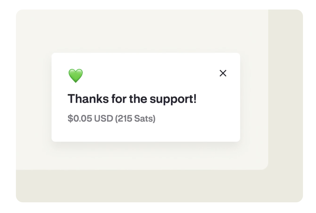
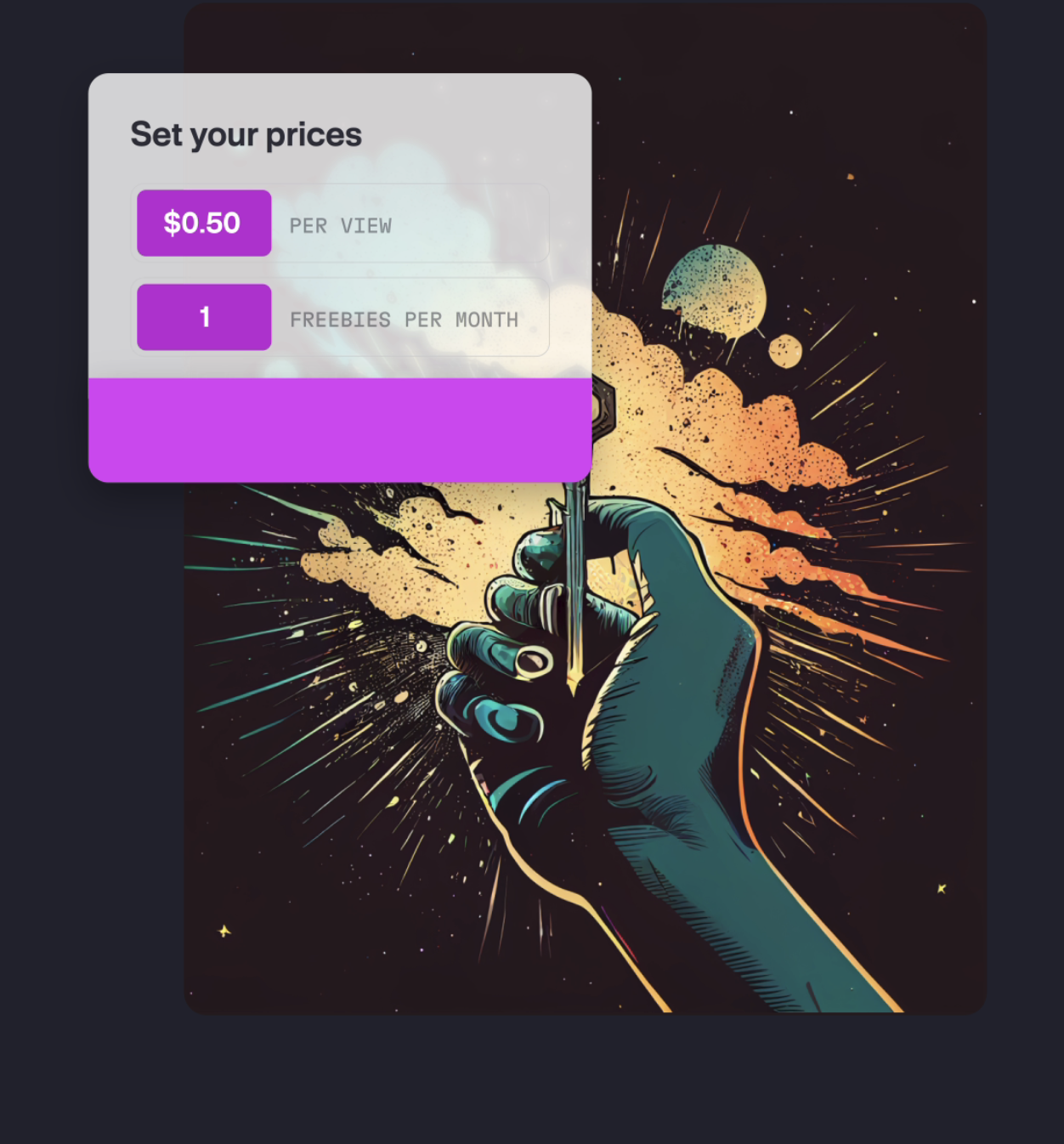
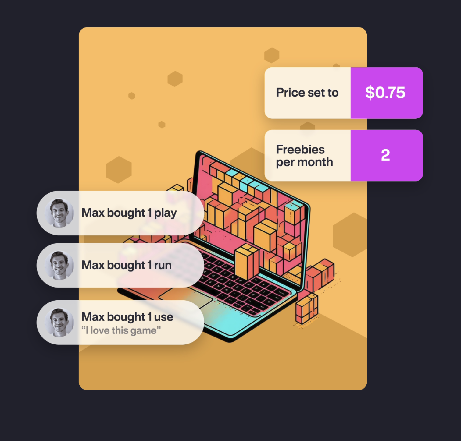
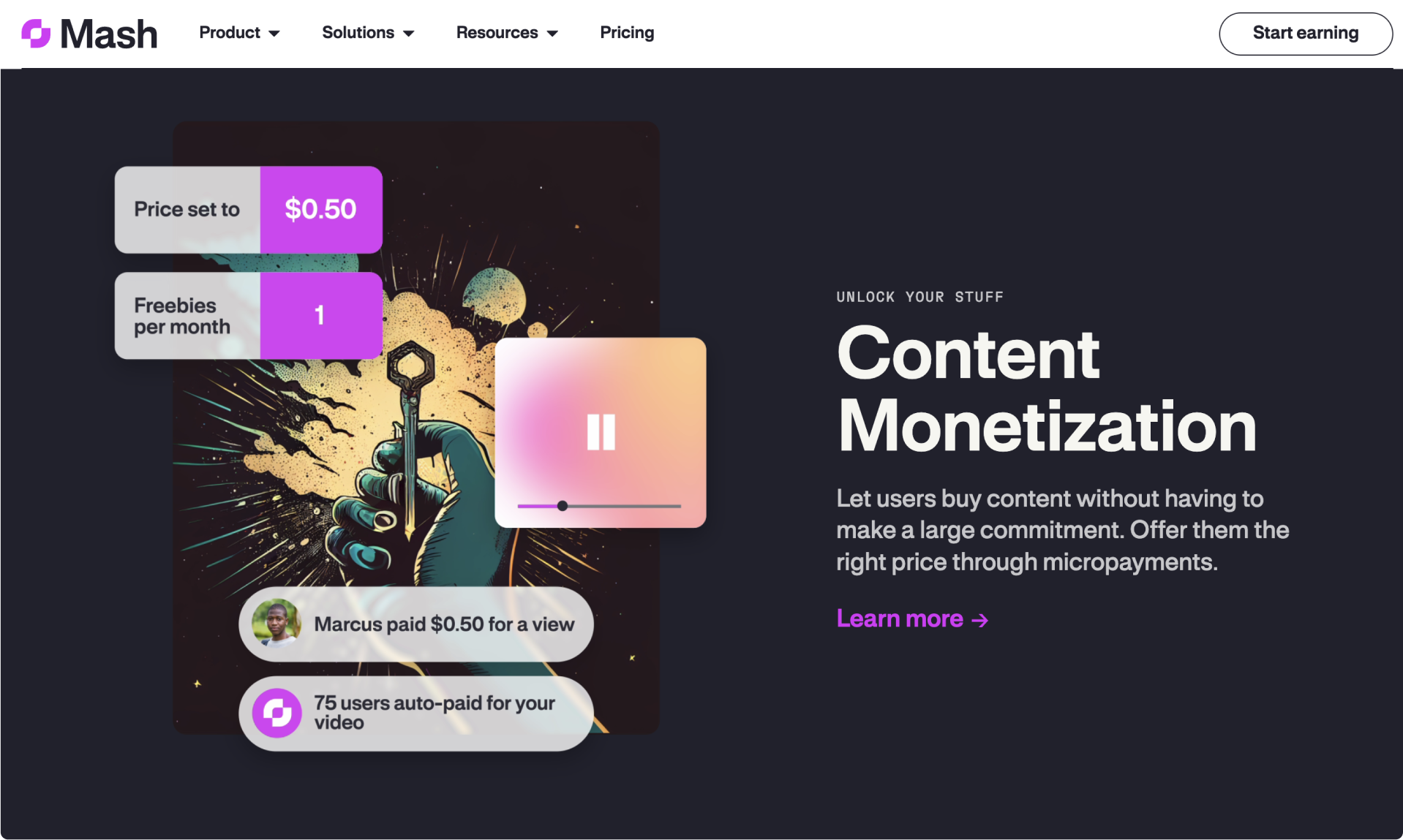
Designed to accommodate content creators, indie developers, artists and gamers, Mash enables creators to earn money directly from their content with minimal interference, and allows audiences to only pay for what they actively enjoy.
My ROle


For me, Mash began as an applied exposure to bitcoin, blockchain, the lightning network and online monetization strategies.
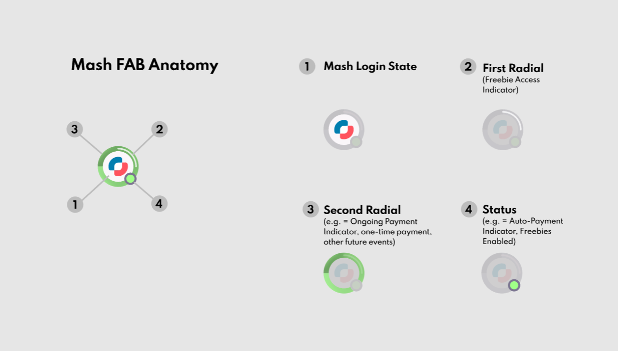
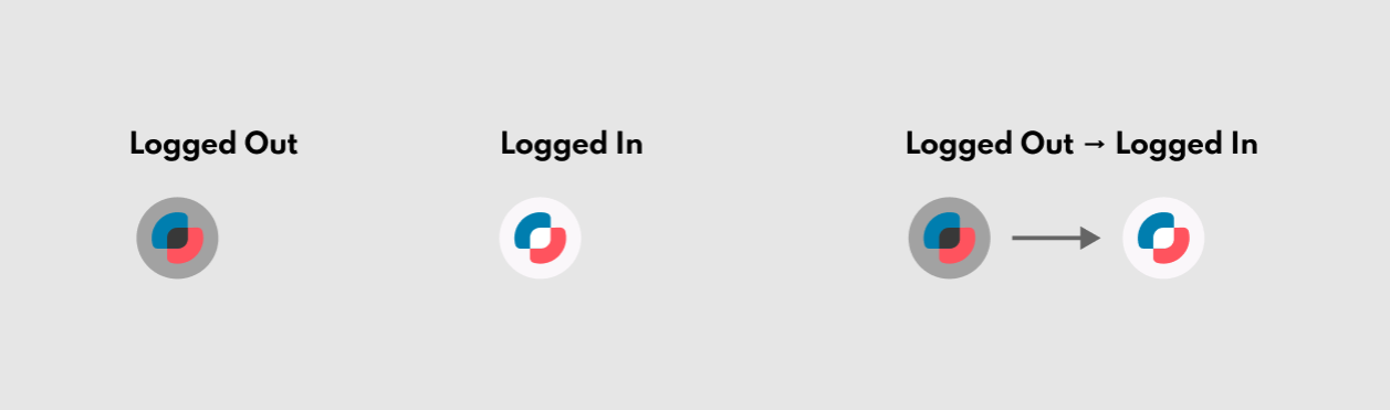
As the Founding Design Lead, I defined the company name and identity, then built a minimalist design system. This became the source of truth for the team; from there, we collaborated to explore and expand upon these foundations, aligning on priorities, then concepting, building, testing, iterating and adding features to our core product.
At this stage, I concentrated on product design, UI and visual design, creating wireflows, animations and motion graphics, prototypes, and hi-fi screens for product and A/B testing to refine UX and interaction strategy.

Before our MVP was launched, I also provided marketing support and creative direction to refine the brand positioning and marketing content, then establish a website.
I also helped promote our work as brand ambassador both online and in person at events in Europe, Canada and the USA.
Brand & Product Design process
Challenge:
Simplify a complex concept
Create a recognizable identity
Convey elements of tech, finance, trust and security, creation, enjoyment and consumption
Reach / impact a global audience
Avoid boring tech tropes (blue + white, bitcoin orange, etc.) and stand out amongst competitors
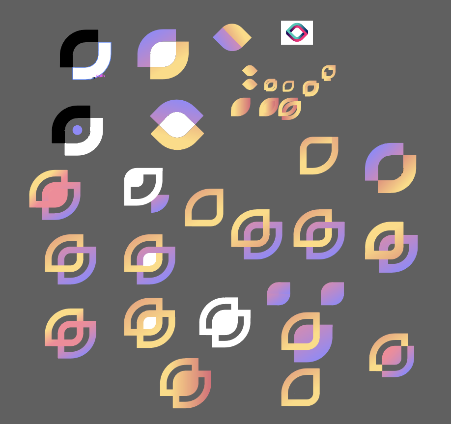
Name & logo Concepts


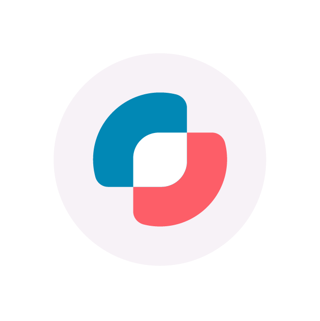
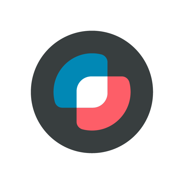
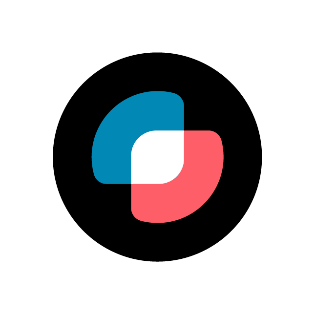


Final Identity
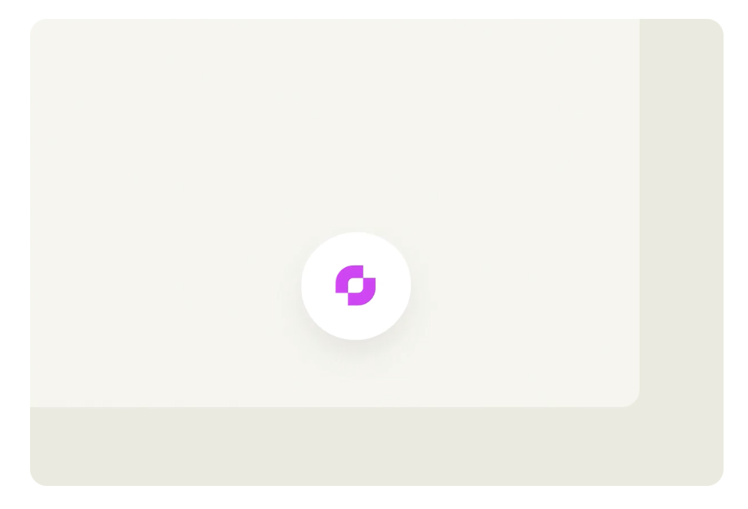
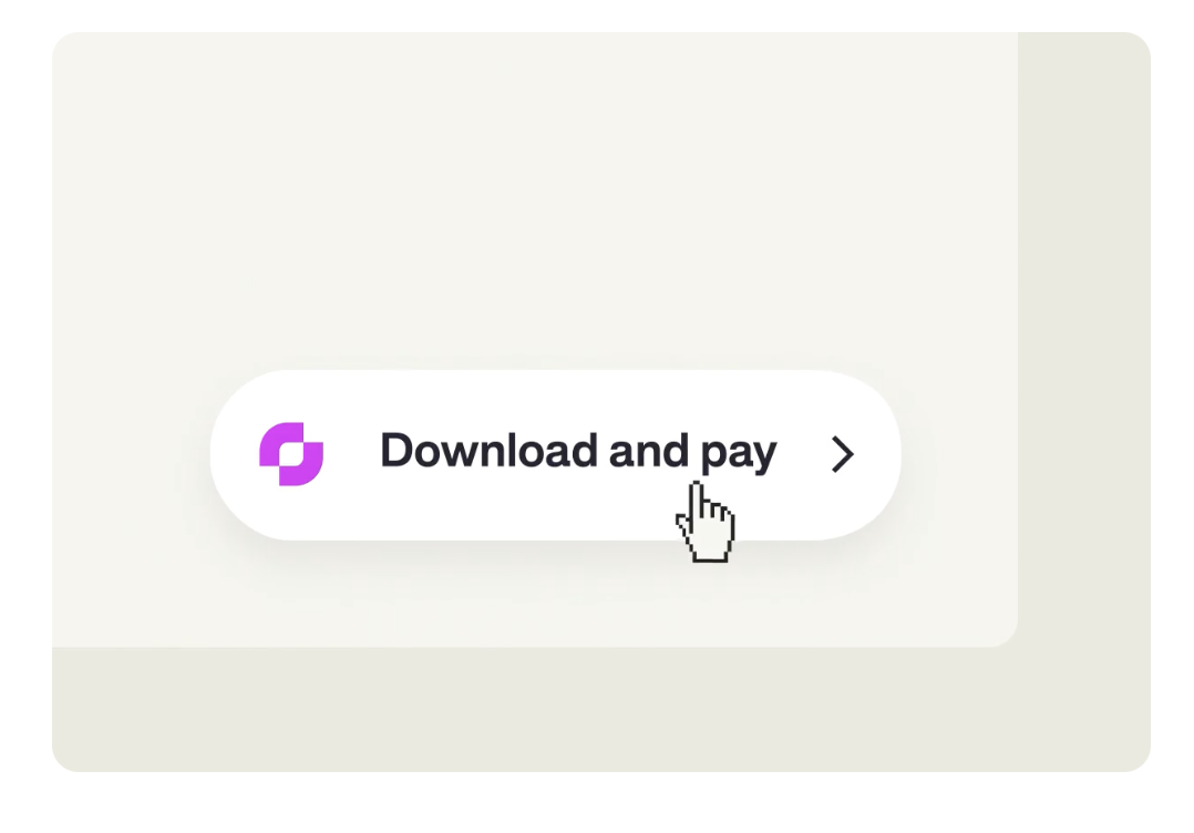
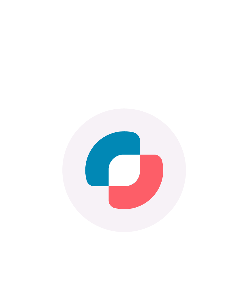
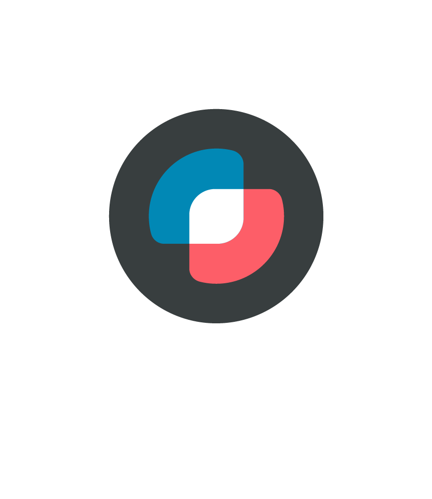
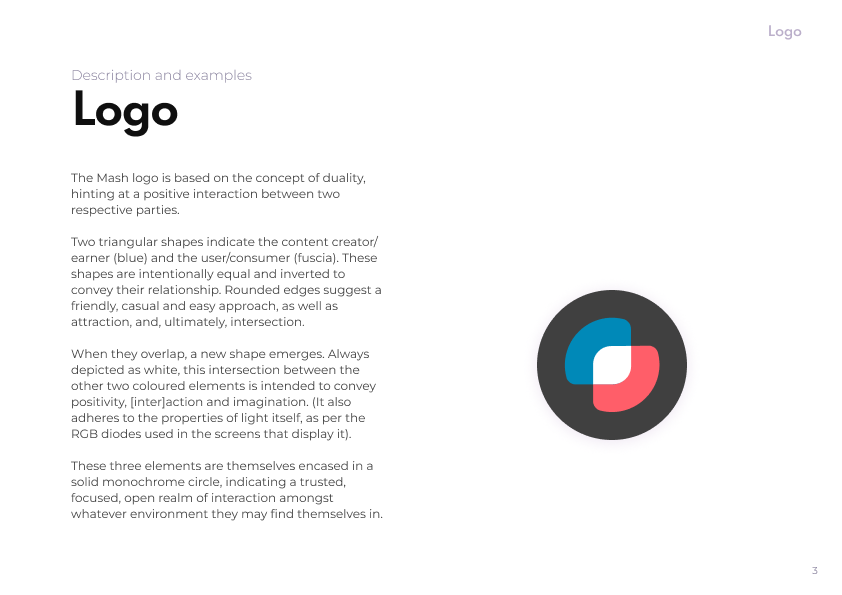
Intentionally simple, the Mash logo combines layered minimalism with binary interaction as a simple representation of the platform itself.


I designed the Mash logo based on the concept of duality, hinting at a positive interaction between two parties.
Two triangular shapes indicate the content creator/earner and the user/consumer. These shapes are intentionally equal to convey their relationship: rounded edges suggest a friendly, casual and easy approach, as well as attraction, and, ultimately, intersection.
When they overlap, a new shape emerges - suggesting exchange and/or transaction.

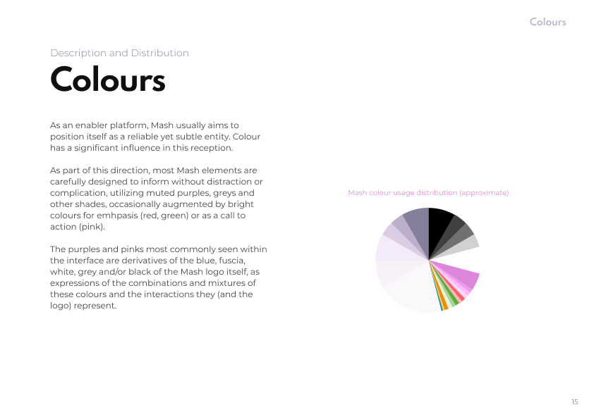
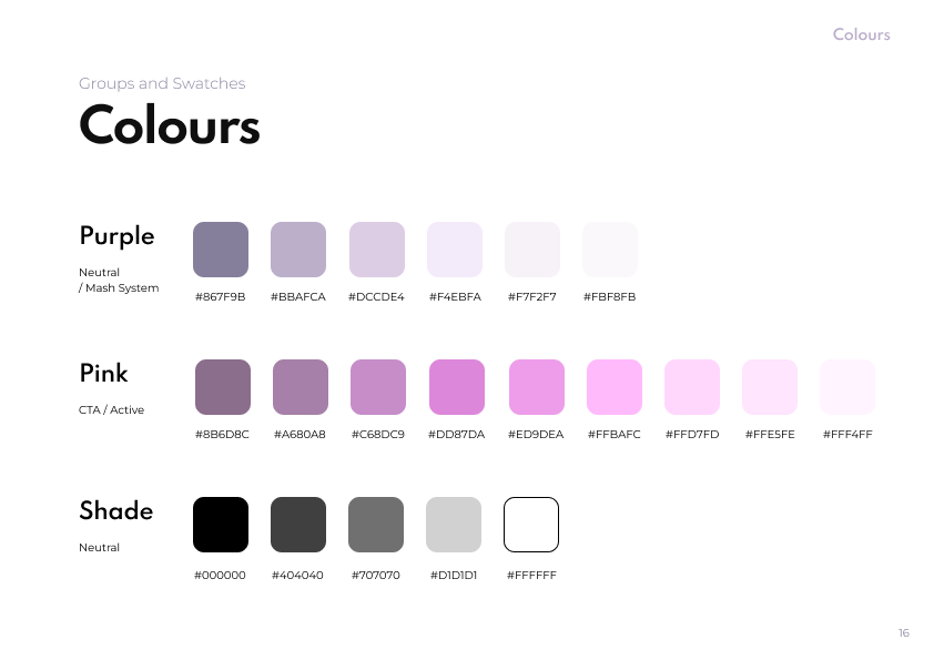
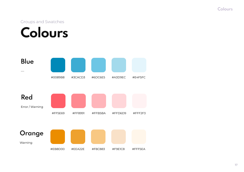
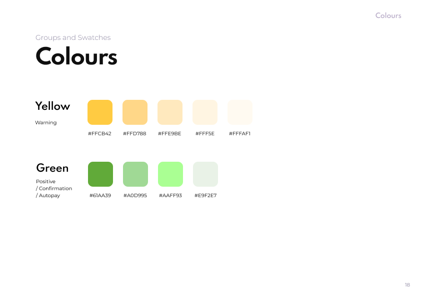
A striking violet serves to ground this relationship amongst monocromatic (or very muted) backgrounds, inferring a bold, trusted, focused, open realm of interaction within any environment.
Bitcoin orange compliments this colour, adding warmth when necessary; black and white elements echo the rudimentary ones and zeros of binary code at the heart of all digital applications.
Complimentary palettes provide contrast within the visual language, utilizing spot colours in a pulp art style where appropriate.

Impact and outcome
Since launching our Beta in 2022, Mash has gained traction as a viable payment system and an established entity within the blockchain community.

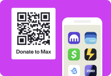
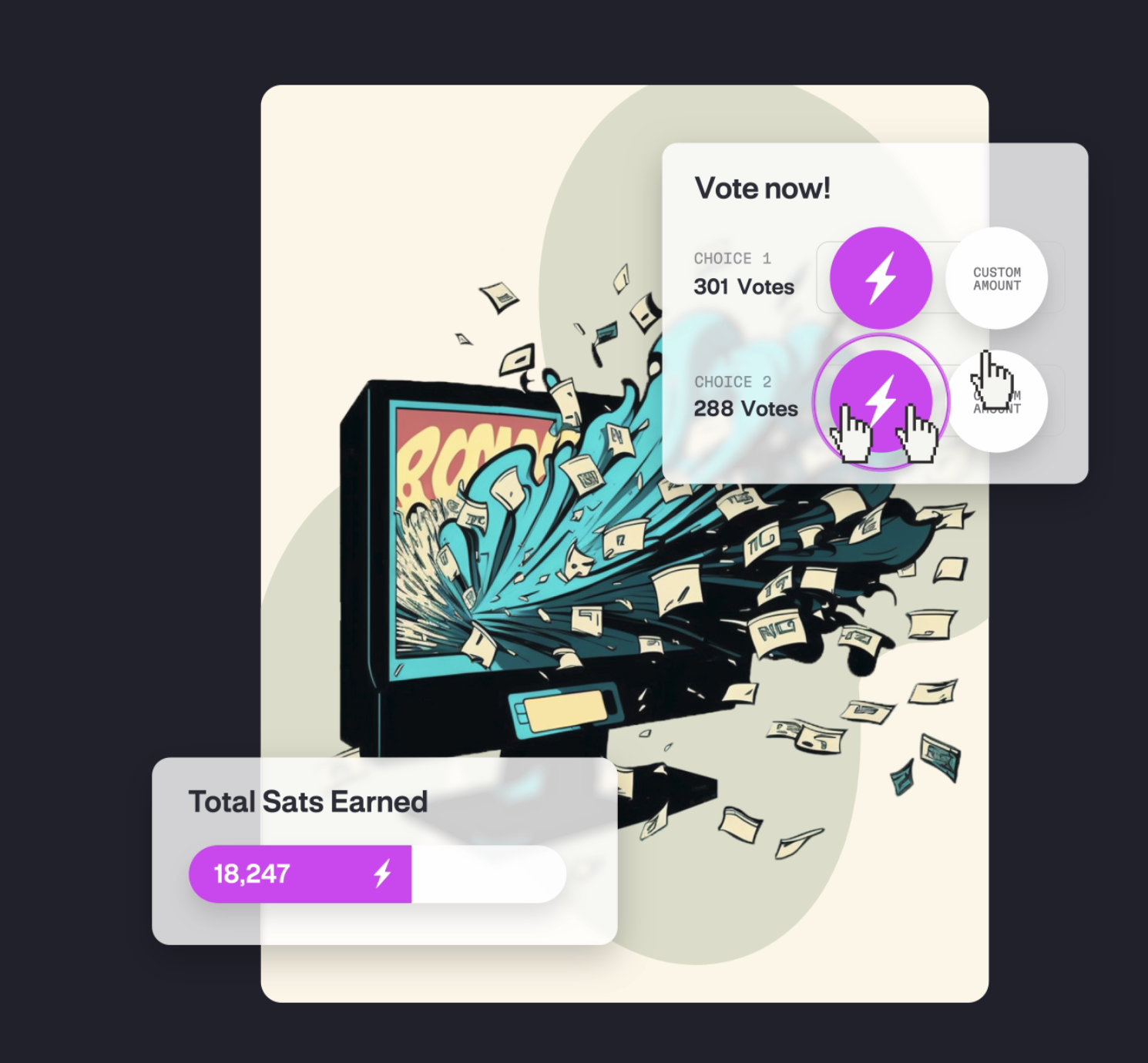
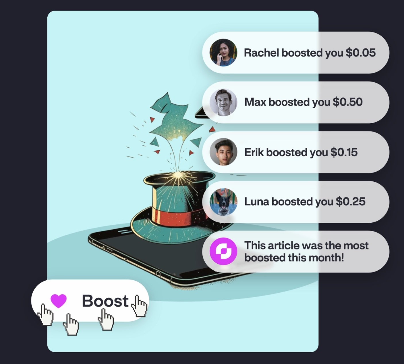
Mash is now used as a fair payment service for various news sites, blogs, e-books, apps, games, crowd-funding campaigns and time-based polls.

We’ve also built out an SDK to help enable creators to assist with integration on various platforms.
Lessons learned
Collaborating as the sole Creative amongst a small team of developers and a business admin is a professional challenge, both for process awareness / involvement and project execution. This role has exposed me to the limits one designer can extend to, as well has how to recognize weaknesses, explain and exemplify design methodology, manage expectations, plan complicated roadmaps, prioritize and when / how to appropriately outsource tasks.
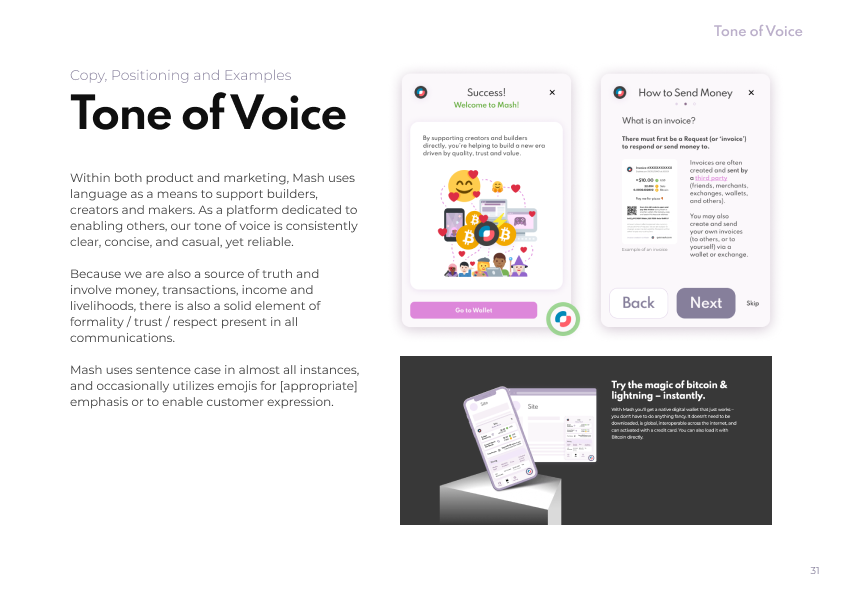
Clarity, trust, support and understanding are critical when developing an innovative new project that has never before been attempted… especially within a tight little team. (Particularly so when you’re the only Creative, as well as living on a different continent, in a time zone six hours ahead!)
UX and QA testing can be absolutely pivotal processes to responsibly facilitate and execute in order to gather data to inform decisions, ensure user-focus, and help avoid Design by Committee.