

combining analog and digital methods, I crafted A UNIQUE logo and brand IDENTITY for Studio49.

This challenging corporate branding project involved numerous concept explorations, five bags of coffee, power tools, a pile of junk and two skilled hands.
Let me walk you through the design process...
Formed in April 2016, Studio49 was a mobile games studio located in Kreuzberg, Berlin. Studio49 developed fun, whimsical, colourful games for international audiences of all ages.
As the Communication Designer, I was tasked with creating a logo for this start-up organization. My Initial drafts explored literal and thematic elements, sometimes branching into fringe tangents, including iconic Berlin references, mythology, adventure, puzzles, fantasy and fun itself. Some of the more memorable examples are featured here.


Not fully satisfied the direction of these concepts, I hit a creative block.
After cranking out an entire collection of digital concept ideas, none of them seemed to strongly resonate with the company values, exemplify the team or our projects.
I was stuck, and I knew it.
To address this, I went on a tangent design spree, entertaining flippant ideas, listening to experimental music and drinking a lot of espresso. Eventually, I landed on a core design element that anchored the rest of the process, and also provided a palette to work with....

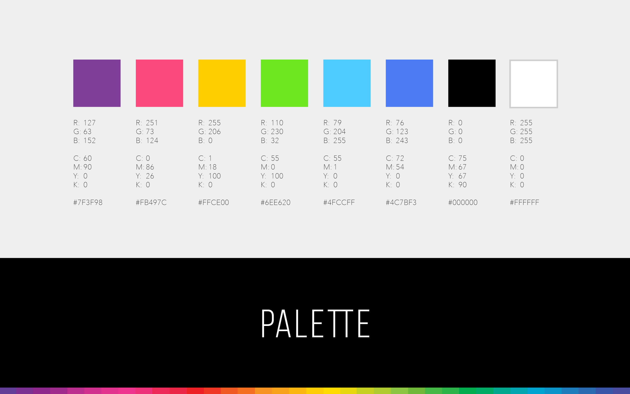
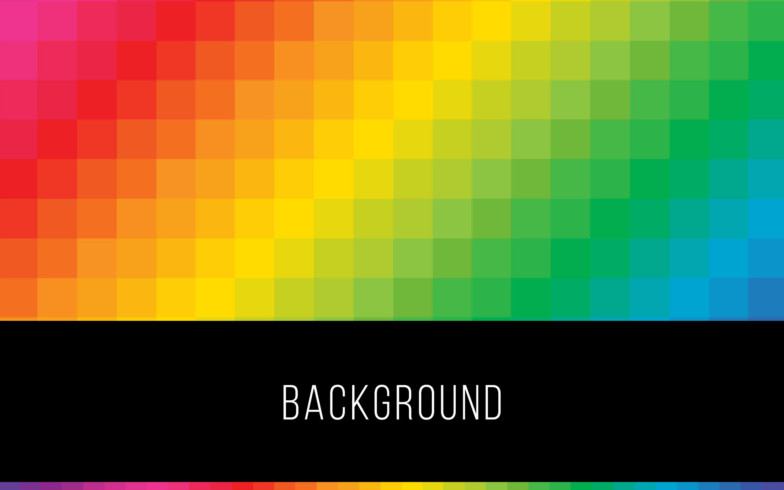
By combining the 8-bit roots of video game graphics with the playful spectrum of a rainbow, I created this playful, versatile and pixellated visual anchor.
As a long-revered visual element, the pixel is synonymous with video game culture and modern design. Though not enough to form a logo, this visual element became the key influence for the Studio49 visual identity.
After defining this visual direction, I took a break from logo concept design to explore ways to explore and interpret it, reflecting upon how to illustrate the people, personalities and values within the team.
I THEN developed a fun 8-bit pixel portrait style that quickly became immediately popular.
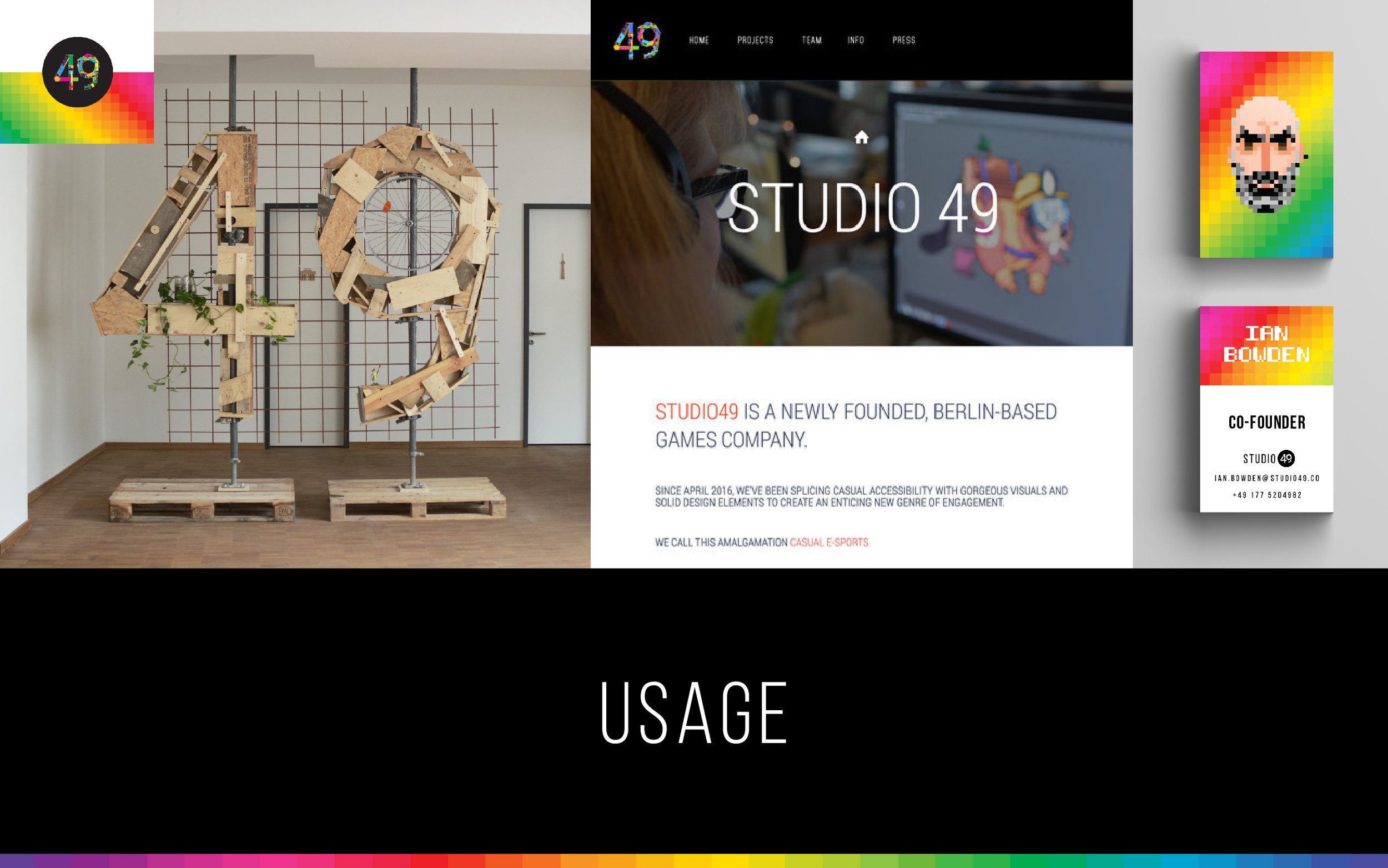
After interpreting the likeness of each individual, I then selected a palette from the Pixel Spectrum element, and assigned coloured backgrounds for roles. Developers became Magenta, Designers and Artists were cyan, executives = rainbow, Project Managers = black and HR was coded yellow. (I also created a profile for our beloved coffee machine).
Though effective as static images, these portraits lacked true dynamism. By carefully animating each character, I added a glimpse of personality through simple .GIF animation. The result was overwhelmingly positive, and this playful visual treatment became another component of the Studio49 brand identity.


At this point, I began experimenting with typography pairing. Based on the digital team portraits, I developed and printed business cards and other collateral to support my existing work.


Though aesthetically pleasant, I simply wasn't satisfied with the predictable parallels between pixellated visuals and chunky typography.
The complete Studio49 brand required a missing organic element - something truly unique to create an appropriate, viable logo.
For the second time during this project, I found myself in a creative lull. Exhausted, I wasn't sure how to constructively progress,
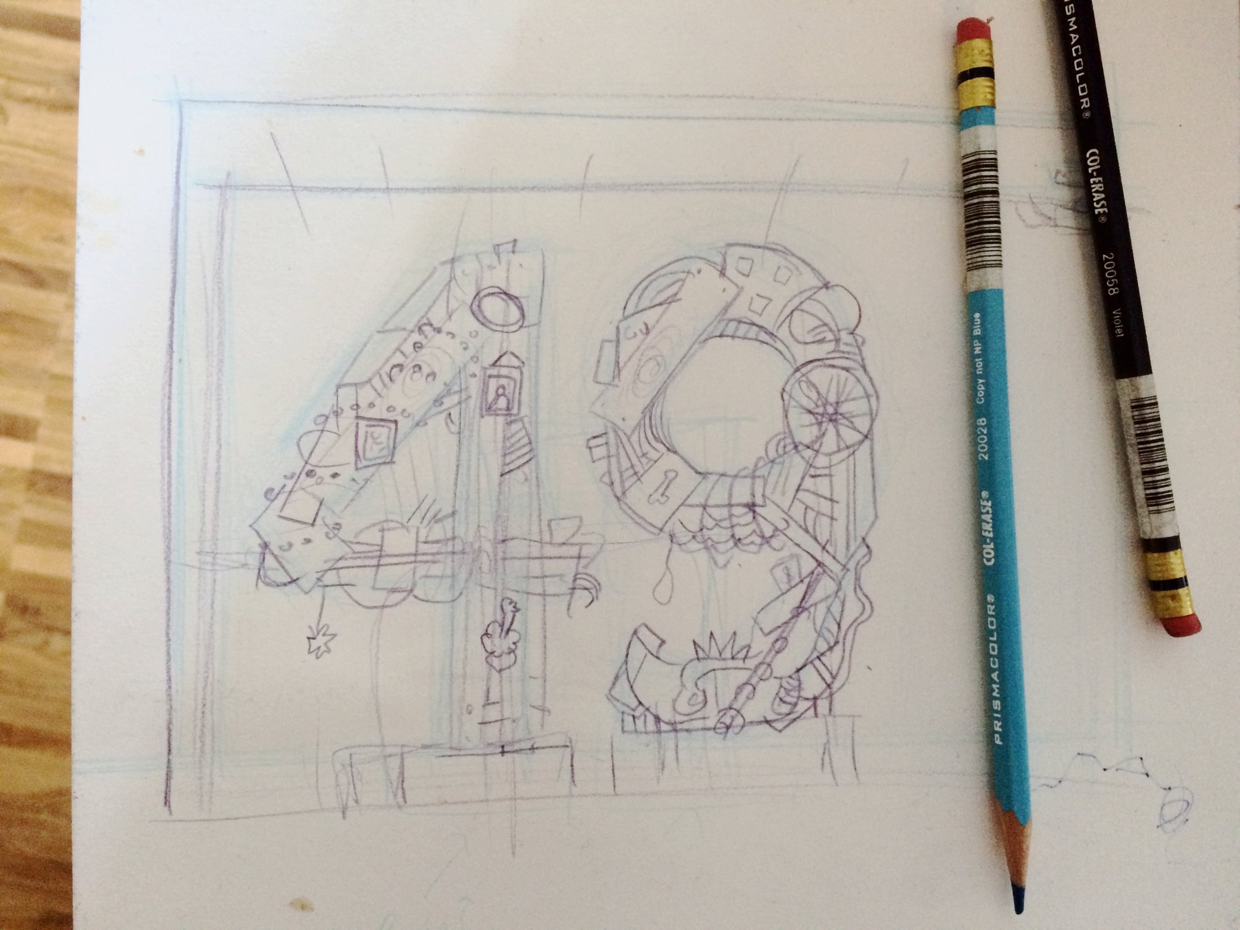
I reassessed my digital process and resolved to try something new, using analog means, materials and methods to see what might happen. In addition to my digital design work, I am also a craftsman, scavenger and industrial artist, creating furniture and decor. Thus, I turned to this applied skill set to realise a semi-permanent signage idea.
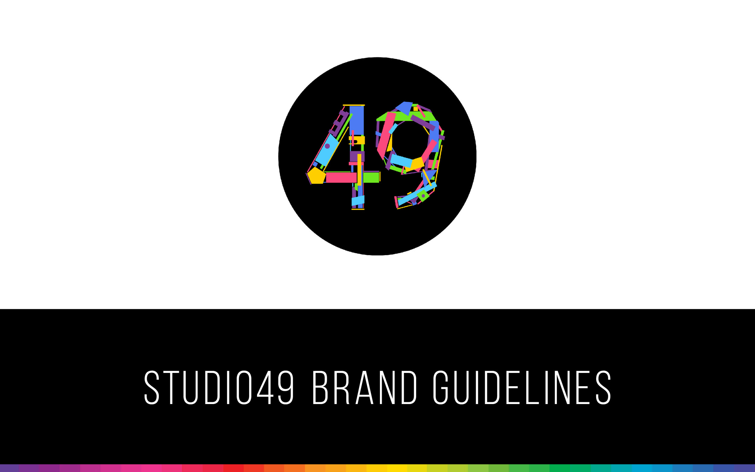
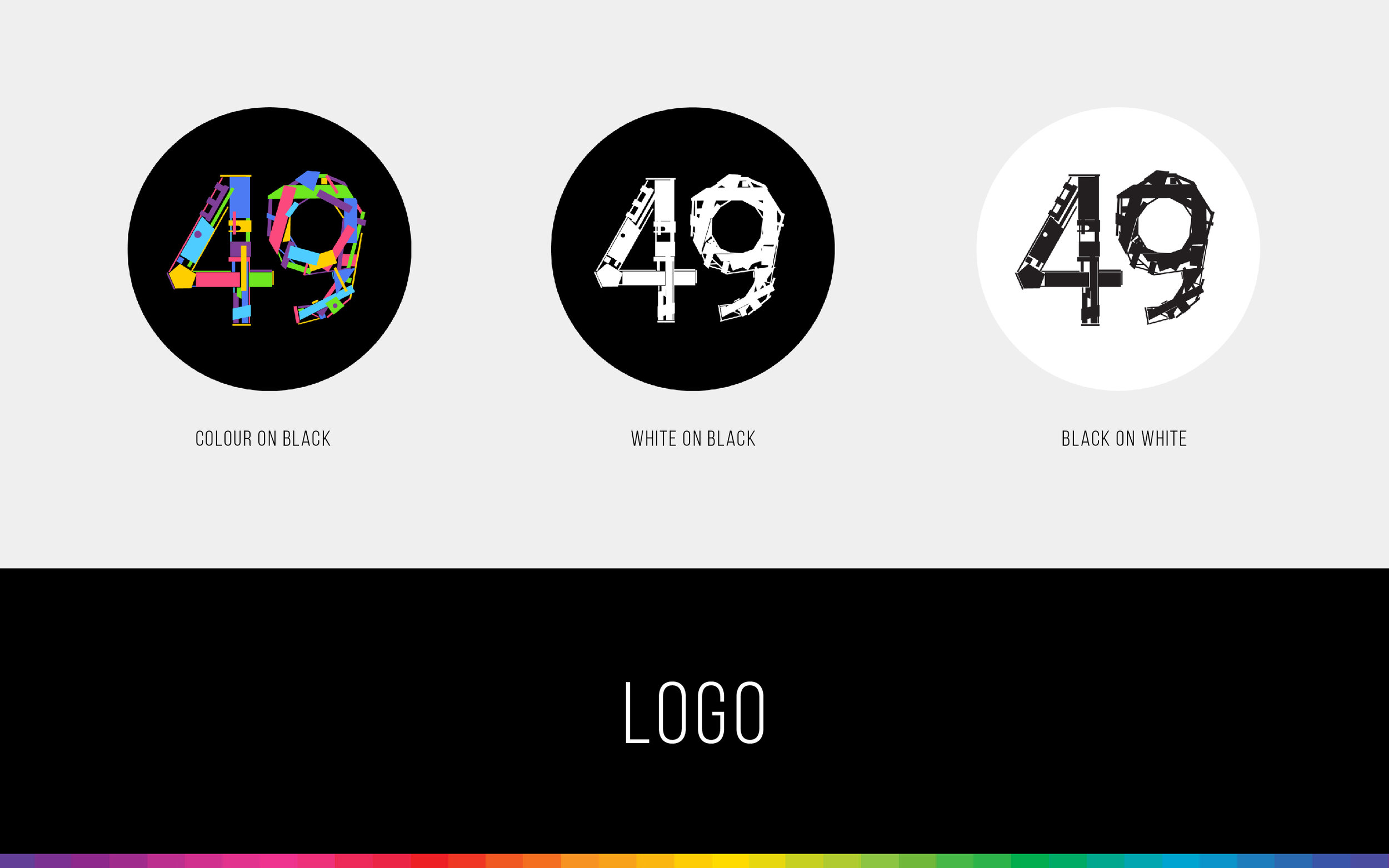
Upcycled from scraps found in office courtyard renovation dumpsters, I built two free-standing, six-foot-tall NUMERALS.


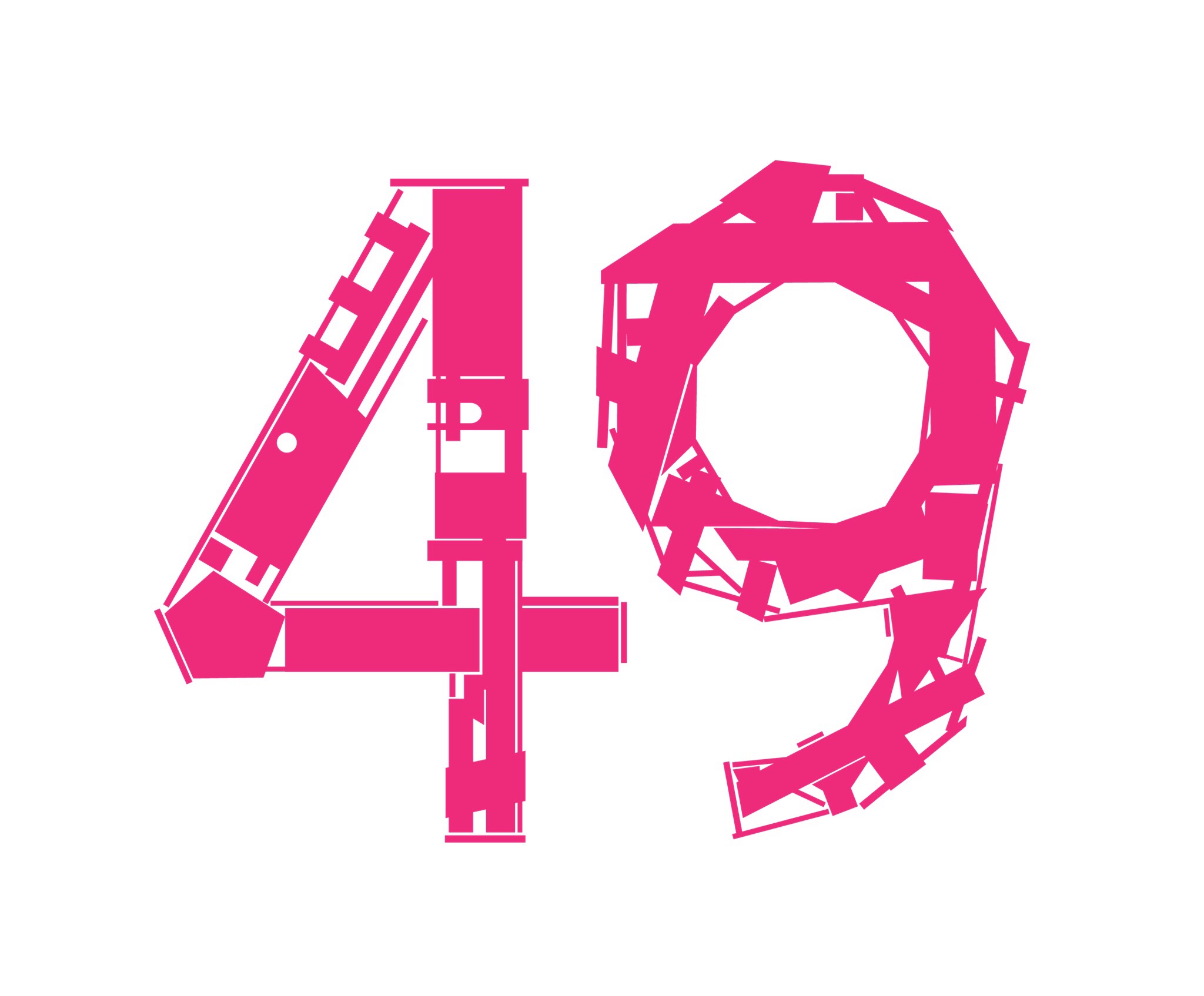
A stark contrast to my previous colourful identity elements, this bespoke 49 was then mounted on wooden palettes, braced with rebar and mounted to the studio lobby ceiling.
When complete, I knew I'd fashioned something special that might accent my earlier work.
I had finally found a potential logo solution for Studio49 GmbH.
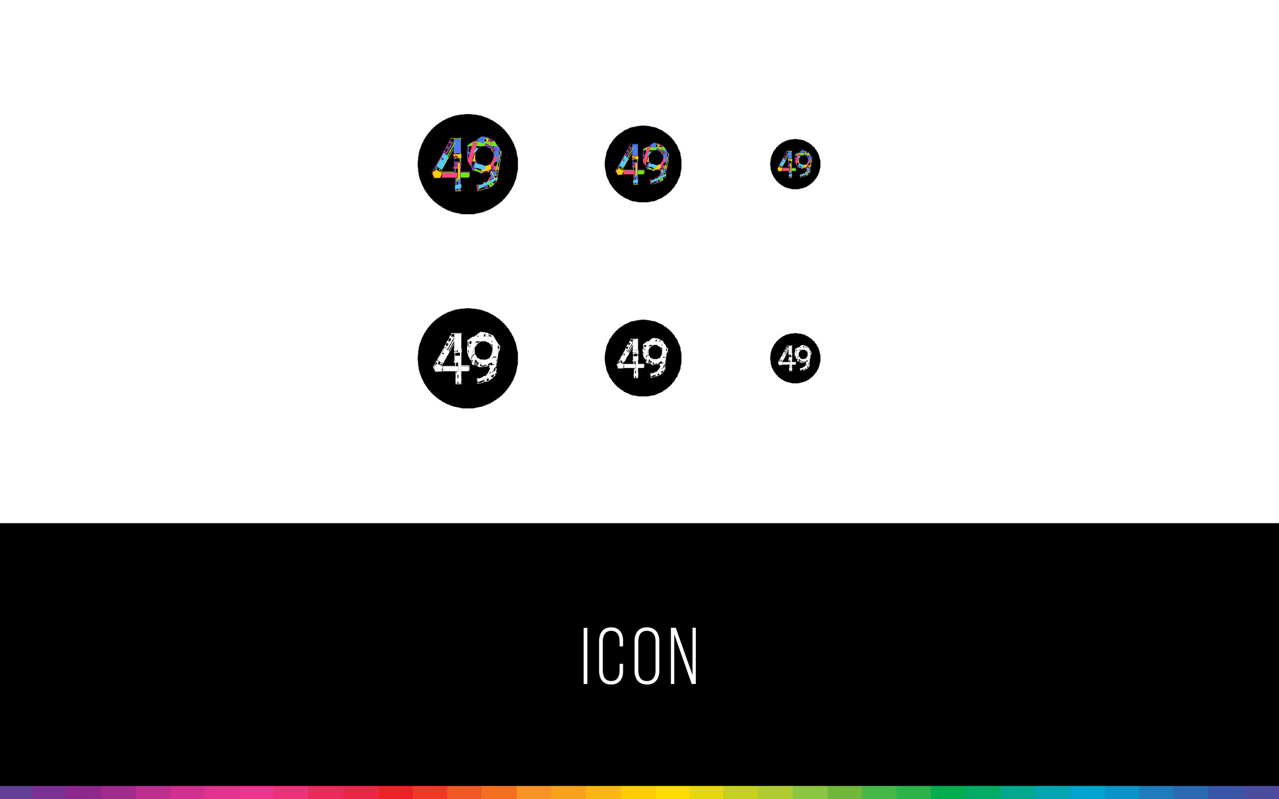
Next, I digitally recreated the installation, and colourized pieces using the existing pixel portrait palette.


To create an app onboarding screen animation. I then ordered the pieces into layers and animated them to appear exponentially faster, as though built from scratch, like the lobby signage itself.