TASK:
Develop a visual campaign concept for the Hybrid V2, a new luxury mattress model designed by Emma, the Sleep Company.
AUDIENCE / PERSONAS / DEMOGRAPHIC:
Affluent international VIP professionals who appreciate/actively consume luxury lifestyle comforts, products and services.
ideation Process
Emma Identity, Product and content Review


ANALYSIS & IDEAS
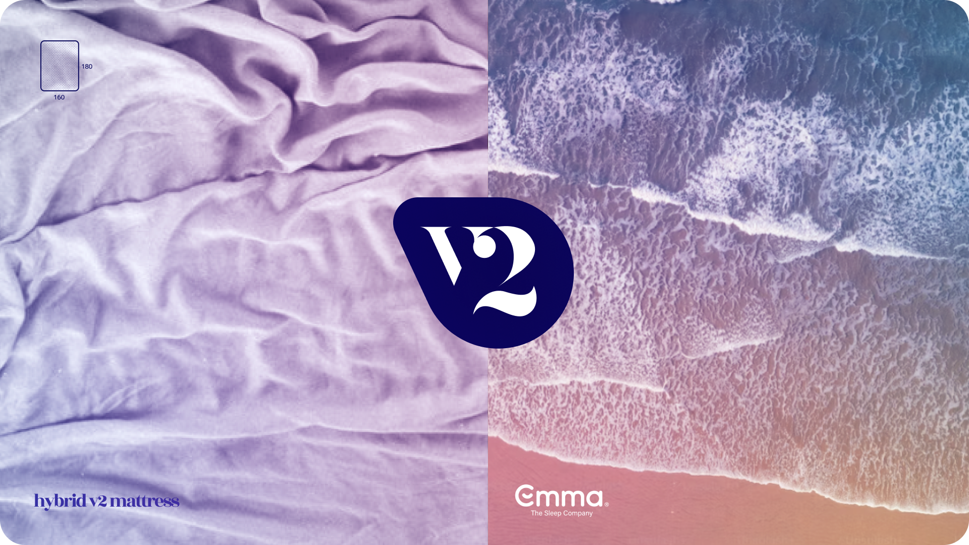
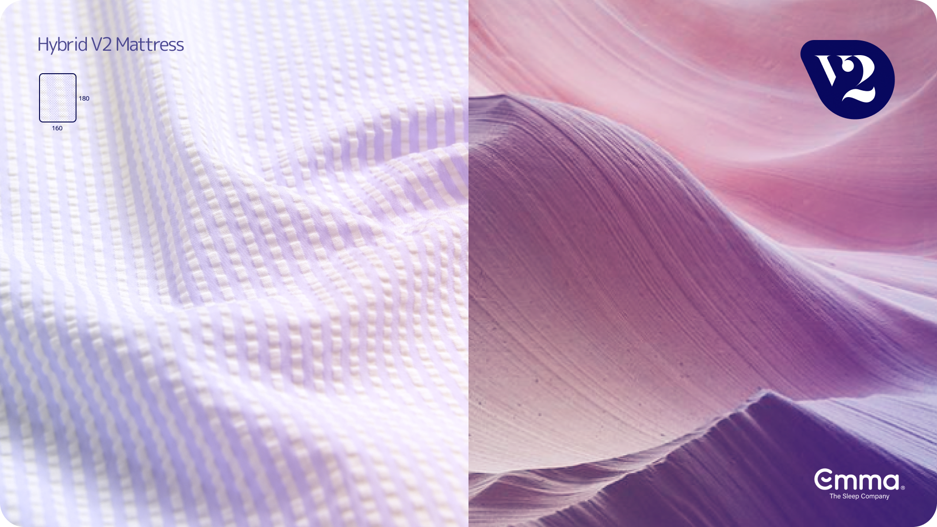
For this task, I considered and explored a product/identity/marketing campaign based on a concept of duality, emphasizing the best of two worlds - comfort and technology - combined in strong, obvious contrasts sharing similar composition, movement, appearance and/or association.
This concept accommodates key points mentioned in the project USPs, such as:
Airflow/breathability:
atmosphere, climate and weather systems, wind/clouds, breeze among leaves/flowers, etc.Premium/luxury:
fine fabrics/patterns/textures, minimalist art direction, simple colour combinations and substantial layout clearspaceDesign/technology:
modern-looking, clean and soft items contrasted amongst raw nature/landscapes
Comfort/serenity/support:
soft, relaxing, calm, gentle atmospheres (avoiding negative or sinking associations)
Sustainability:
eco-consciousness association reinforcement through natural environment visualsVersion 2.0:
an improved, premium successor to previous model(s), reinforced by visual consistency of two elements united in a single hybrid product.
Visual imagery research
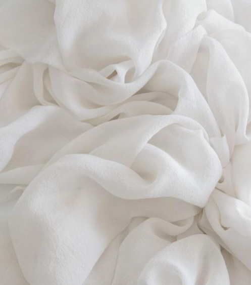
Luxury Fabrics


watercolours


scenic locations


Soft Textures


MINIMALISt Identity design


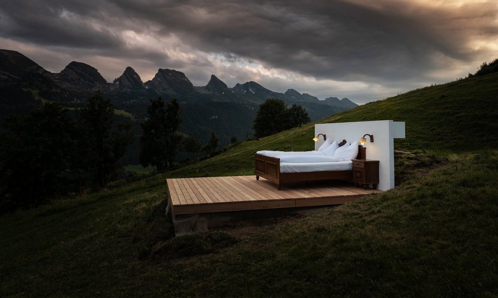
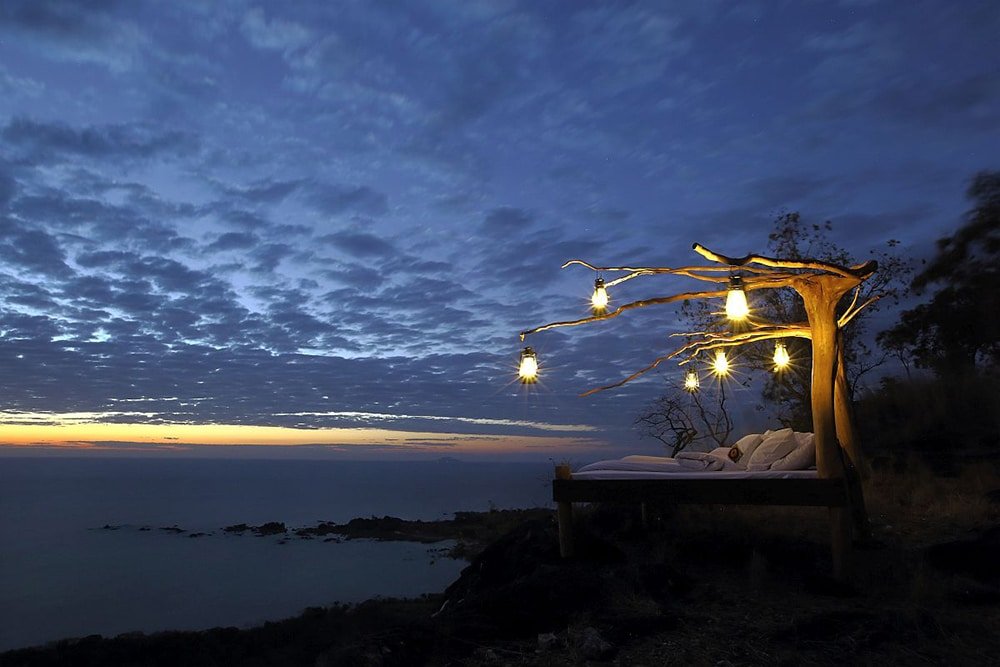
Beds in nature
Though I initially thought that this idea had legs, I quickly abandoned it after realizing just how ubiquitous it seems to be as a bed promotion trope…


Visual Language styles


Layout and graphic design
concept
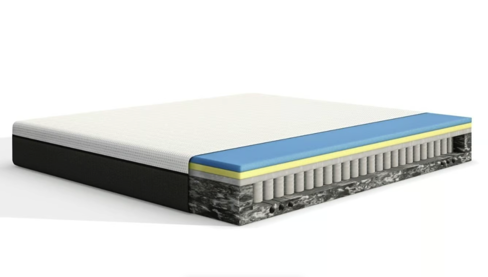
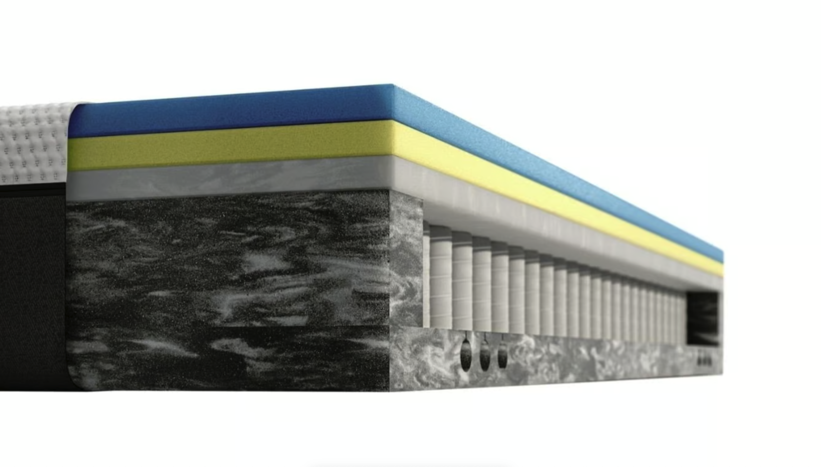
product Design

Seersucker
Considering product and industrial design as well as marketing and promotions, I explored fabrics, textures and their applications. Internationally renowned for its breathability, comfort, lightness, texture, ease of laundry and existing association with luxury fashion applications, seersucker fabric made for an interesting outer mattress fabric idea.


Whether or not this concept is possible or realistic for the Hybrid V2 mattress is beyond the breadth of this ideation task… so I ran with it.
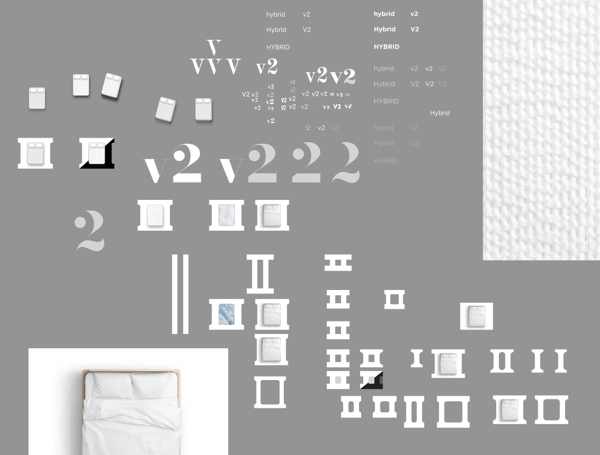
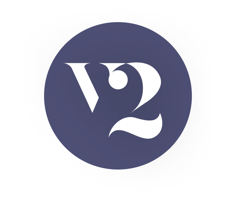
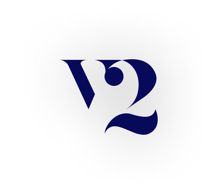
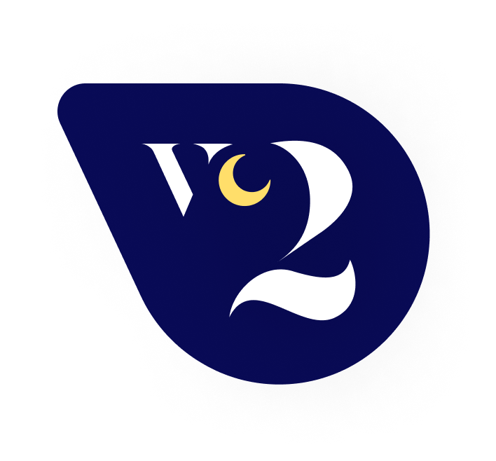
Logo / visual identity
To help identify and differentiate this product within promotions, I created a minimalist logo emphasizing the V and the 2 of this second generation hybrid mattress.
To help audiences connect and associate this campaign with Emma, I derived colours from existing public Emma brand assets and media. Three dark, light and medium hue variants allow adequate visibility among almost any backdrop.
I chose Bodoni Black as the logo font, and then altered the characters to both combine and simplify them. After experimenting with this treatment in layouts, I tried housing it within a circle, and then a teardrop shape, ultimately rounding the sharp edges to align with product associations of comfort, relaxation and softness.


Earlier logo explorations:


Visual language
I opted to Introduce the duality concept through equal vertical division of cleverly aligned imagery.
Careful layout of imagery depicting the product comfort/technology directly juxtaposed by serene natural settings suggests biomimetics, accommodating the task USPs (mentioned earlier in the Analysis section).
This connection could be emphasized with short, subtle taglines emphasizing the focused comparison, and augmented by video footage on appropriate digital platforms.
Layouts are framed with rounded corners to suggest the shape of the product itself. Colour filters are applied when necessary to maintain existing Emma brand palette integrity.
Finally, I integrated the subtle, slowly shifting coloured spotlightlighting featured on the Emma websites….

video transition example
This minimalist approach embraces dynamicism, respects audience intelligence and simultaneously promotes a simple, fun and clever visual concept direction.
It also allows for flexibility through further interpretation and creative associations, shooting footage/imagery from various climates/regions, and/or allowing focusing localized campaigns / dynamic media platforms.
additional static desktop screen layout concepts